Chapter 3, Section 3.3
Treatment of Lead Exposed Children Trial (TLC)
> library(foreign)
> ds <- read.dta("tlc.dta")
> succ <- subset(ds, ds$trt=="Succimer")
> succimerlong <- reshape(succ, idvar="id", varying=c("y0","y1","y4","y6"),
+ v.names="y", timevar="time",time=1:4, direction="long")
> attach(succimerlong)
> week <- time
> week[time==1] <- 0
> week[time==2] <- 1
> week[time==3] <- 4
> week[time==4] <- 6
> interaction.plot(week, id, y, ylim=c(0,70),
+ xlab="Time (in weeks)", ylab="Blood Lead Levels",
+ main="Time Plot, with Joined Line Segments, of Blood Lead Levels",
+ col=c(1:50), legend=F)

> interaction.plot(week, trt, y, type="b", pch=19, ylim=c(10, 30),
+ xlab="Time (in weeks)", ylab="Blood Lead Levels",
+ main="Plot of Mean Response Profile in the Succimer Group", col=2, legend=F)

Six Cities Study of Air Pollution and Health
> library(foreign)
> library(lattice)
> ds <- read.dta("fev1.dta")
> fev <- ds[ds$id!=197,]
> attach(fev)
> y <- logfev1 - log(ht)
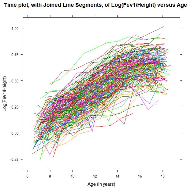
> xyplot(y ~ age, groups = id, type = "l", xlab="Age (in years)",
+ ylab="Log(Fev1/Height)",
+ main="Time plot, with Joined Line Segments, of Log(Fev1/Height) versus Age",
+ scales=list(x=list(at=c(6,8,10,12,14,16,18)),
+ y=list(at=c(-0.25,0.,0.25,0.50,0.75,1.0))))
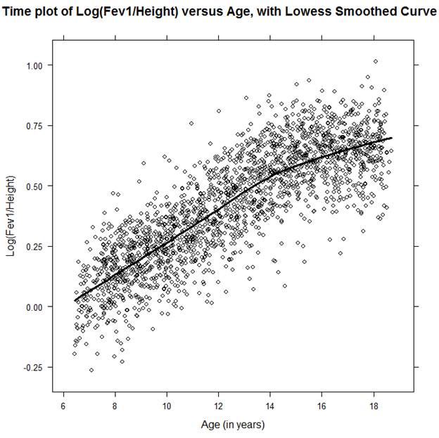
> xyplot (y ~ age, groups=id, panel = function(x, y, type, col, lwd)
+ {panel.xyplot(x, y, type = c("p","smooth"),
col = "black", lwd=3)},
+ xlab = "Age (in years)", ylab = "Log(Fev1/Height)",
+ main="Time plot of Log(Fev1/Height) versus Age, with Lowess Smoothed Curve",
+ scales=list(x=list(at=c(6,8,10,12,14,16,18)),
+ y=list(at=c(-0.25,0.,0.25,0.50,0.75,1.0))))